Turn raw data into useful visualizations presented in a beautifully formatted dashboard for stakeholders to interact with.
What are KPIs?
A KPI is a Key Performance Indicator. KPIs are measurable factors that can demonstrate the success of an organization in achieving their goals. KPIs come from data, and they allow teams to make data-driven decisions about how to move forward. Some examples of KPIs in business include:
- Revenue Growth
- Average Order Value (AOV)
- Profit Margin
- Customer Lifetime Value (CLV)
There are many KPIs depending on the business or organization. In order to be an effective KPI, a measure should be specific, relevant, and achievable.
Why Tableau?
One extremely effective way to communicate KPIs to stakeholders is Tableau. Tableau allows data analysts to communicate findings in a clear, visually appealing, and interactive format. This is done through dashboards. Dashboards are your new best friend!
The benefits of using a Tableau dashboard to communicate KPIs can’t be overstated. Using dashboards, you can create tables and visualizations with filters that stakeholders can interact with. Additionally, Tableau can be connected to a database or spreadsheet which allows visualizations to automatically update as new data becomes available.
One of the best things about Tableau is that the visualizations you can create with it are simply beautiful. In a matter of minutes, you can produce charts and graphs that are sleek, professional, and very aesthetically pleasing.
So follow along with me as we create a simple KPI dashboard using Tableau’s built in practice data, the Superstore dataset!
Step 1: Import the Data
For this tutorial, we’ll be using the Superstore dataset. It’s built in with every Tableau installation. The data is meant to simulate sales data from a huge retailer.
When you open Tableau, you’ll see this homescreen:
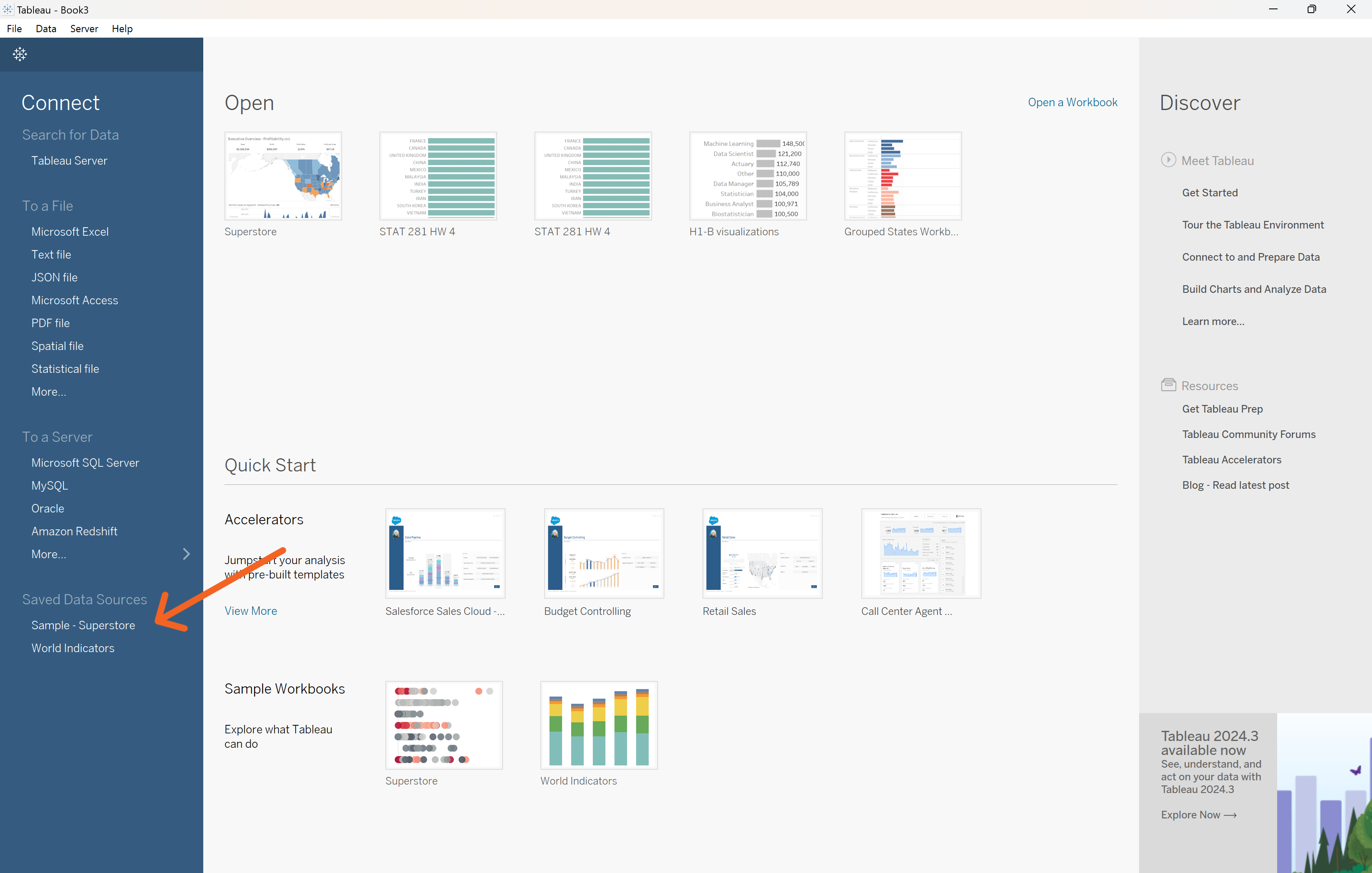
You have many different options for where to source your data from. Click the “Sample-Superstore” dataset.
The next screen Tableau will give you is the Data Source tab. This tab gives you a chance to look over your data, and make sure it looks how you expected it to.
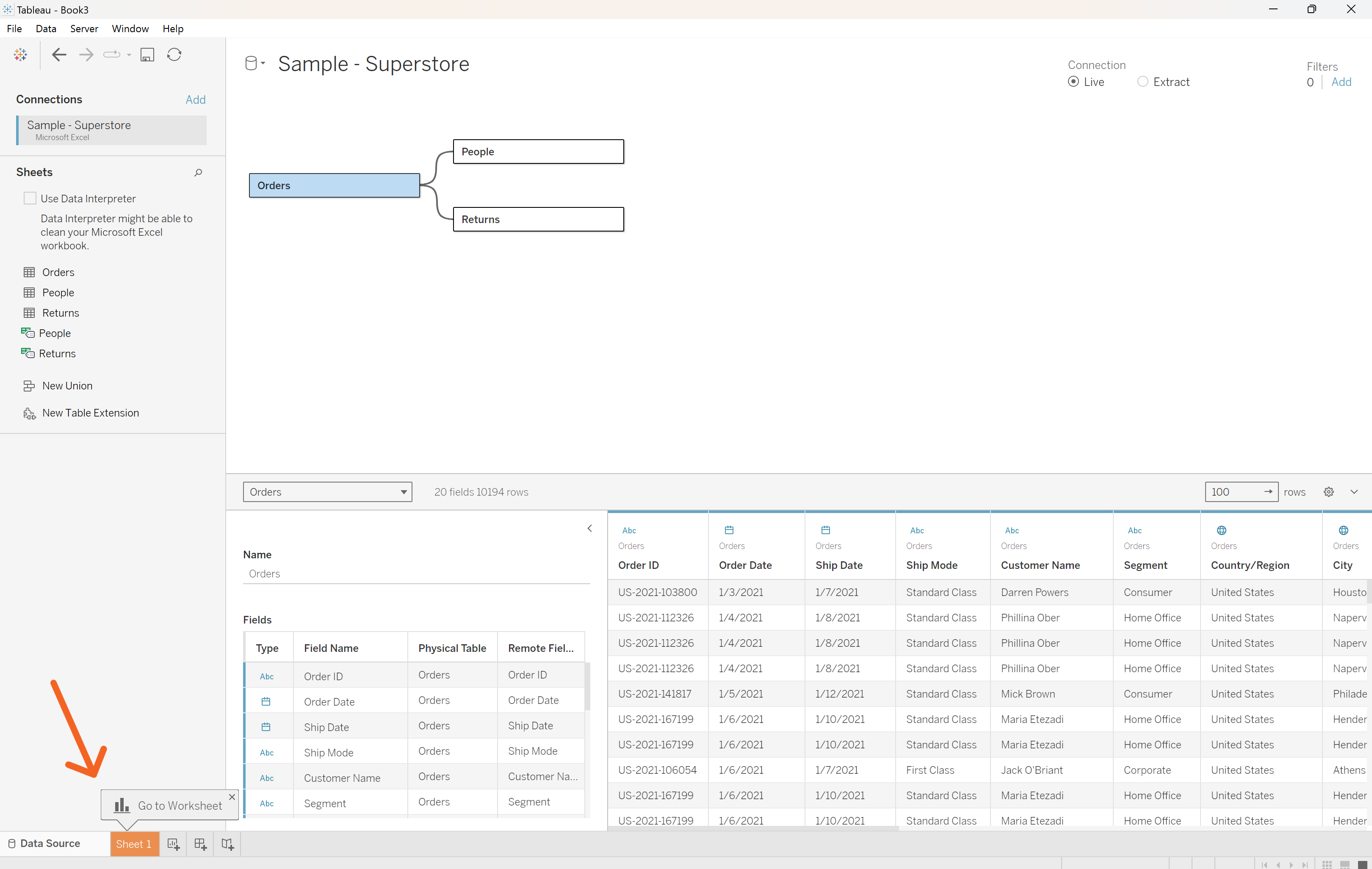
Check to see if qualitative variables are in blue. Tableau calls these “dimensions”. Quantitative variables, or “measures,” as Tableau refers to them, should be displayed in green.
You can also use this tab to make connections between multiple dataframes, which Tableau has automatically done for the three Superstore tables, People, Orders, and Returns.
Click the Sheet 1 tab.
Step 2: Create Visualizations
Now that we’ve got our data loaded in, we can start visualizing it. Each of our graphs will have its own sheet in Tableau.
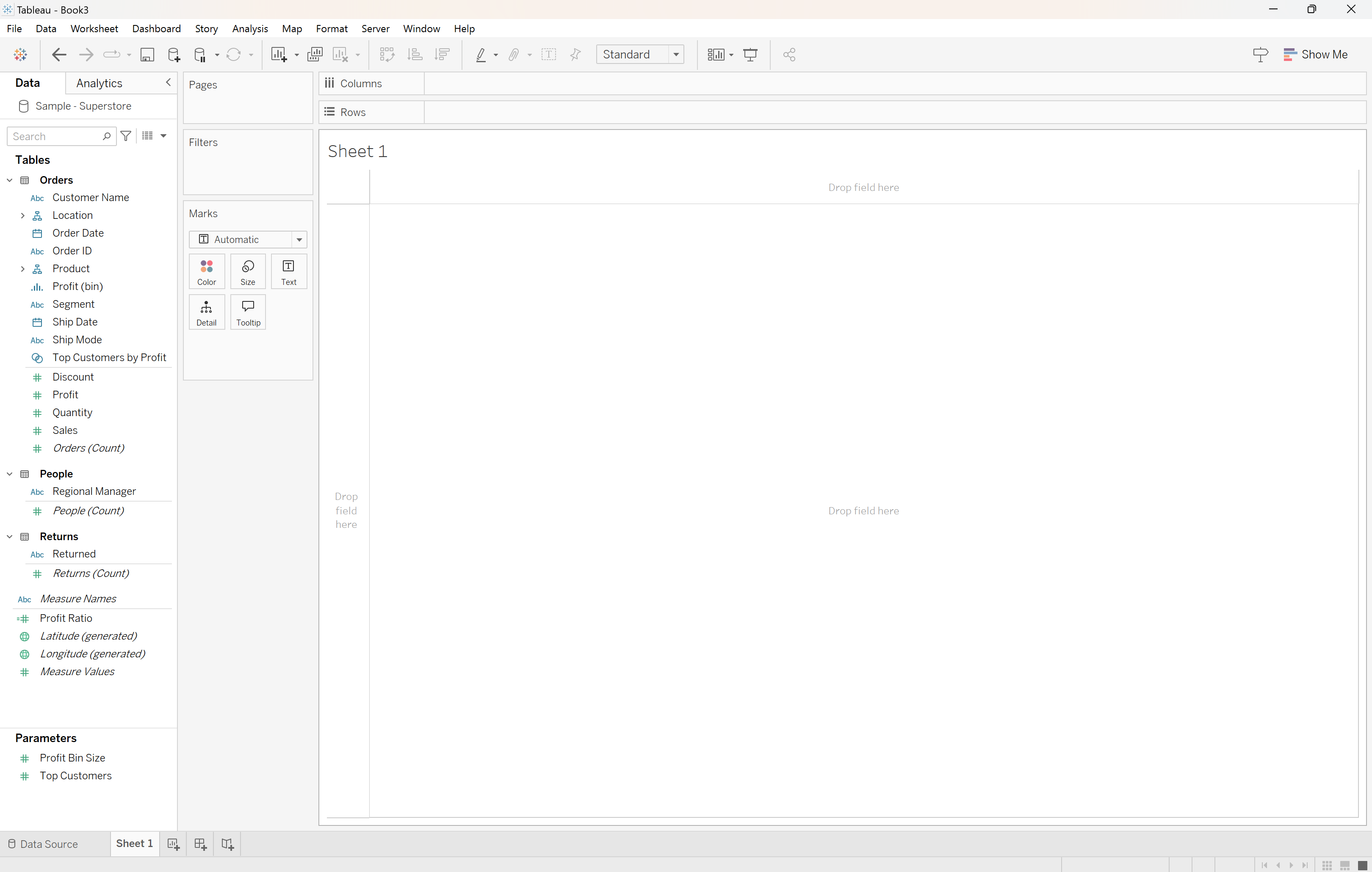
Here is what an empty sheet looks like:
Let’s say that the executives at the Superstore have asked us to create a sales KPI dashboard.
Time Series
Let’s start by making a line graph that will show the sales over time. On the left, we have all of our dimensions and measures. In the middle of the screen, we have the chart that we’re creating.
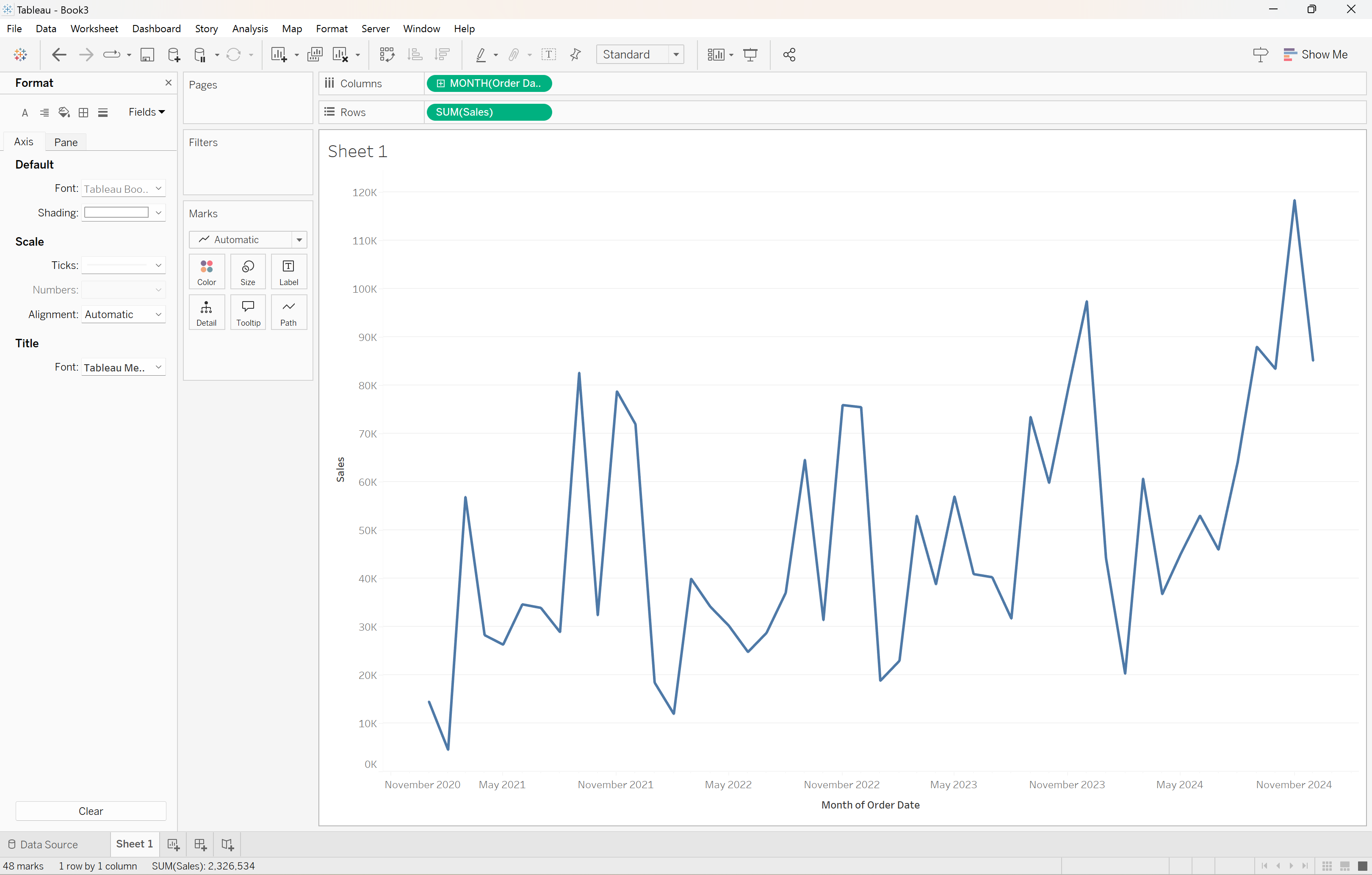
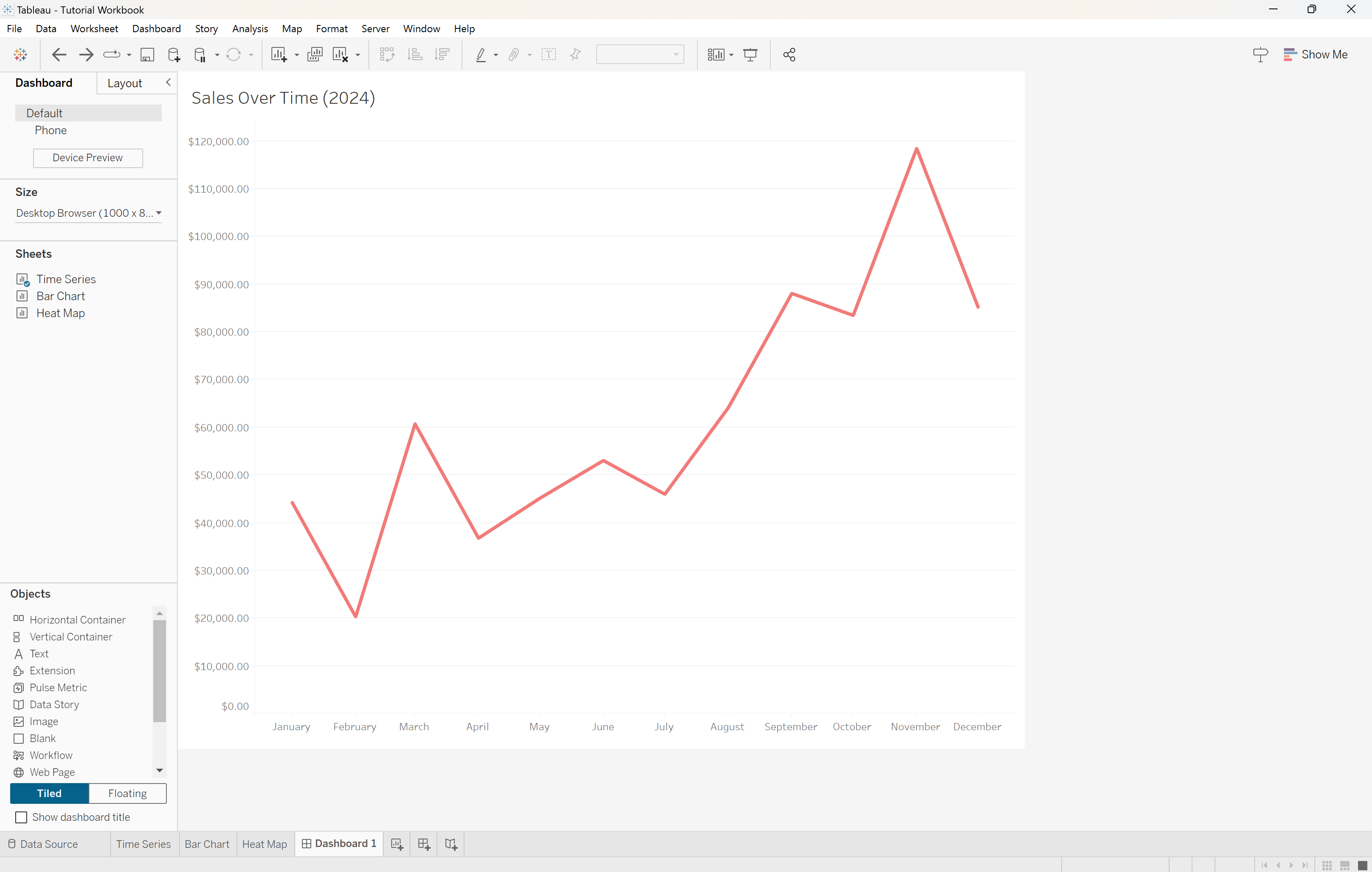
Start by double-clicking Sales and Order Date. Order Date should automatically populate in the columns section at the top of the screen and Sales goes to the rows.
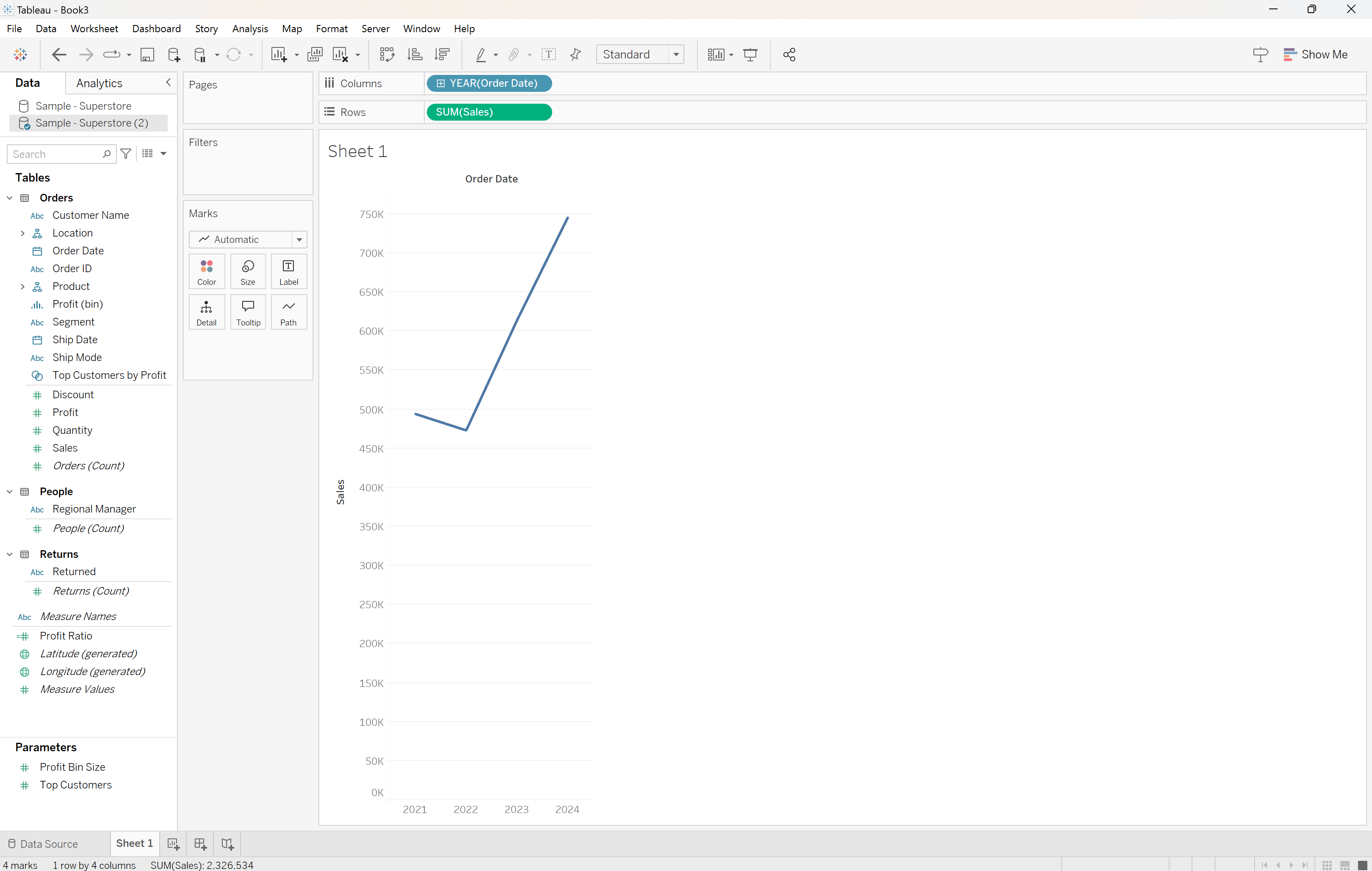
Now we have a line graph of sales over time. Let’s refine this a little bit. Say the executives are most interested in looking at the data from month to month for the year 2024.
To switch the x-axis to show months instead of years, right-click the date dimension and select Month on the dropdown.
Now we’re seeing the data over months instead of years! We just need to filter out everything but 2024.
In order to do this, go back to the variables on the left and drag Order Date to the Filters box. Tableau assumes you want to filter out a range of dates, which is correct, so hit next.
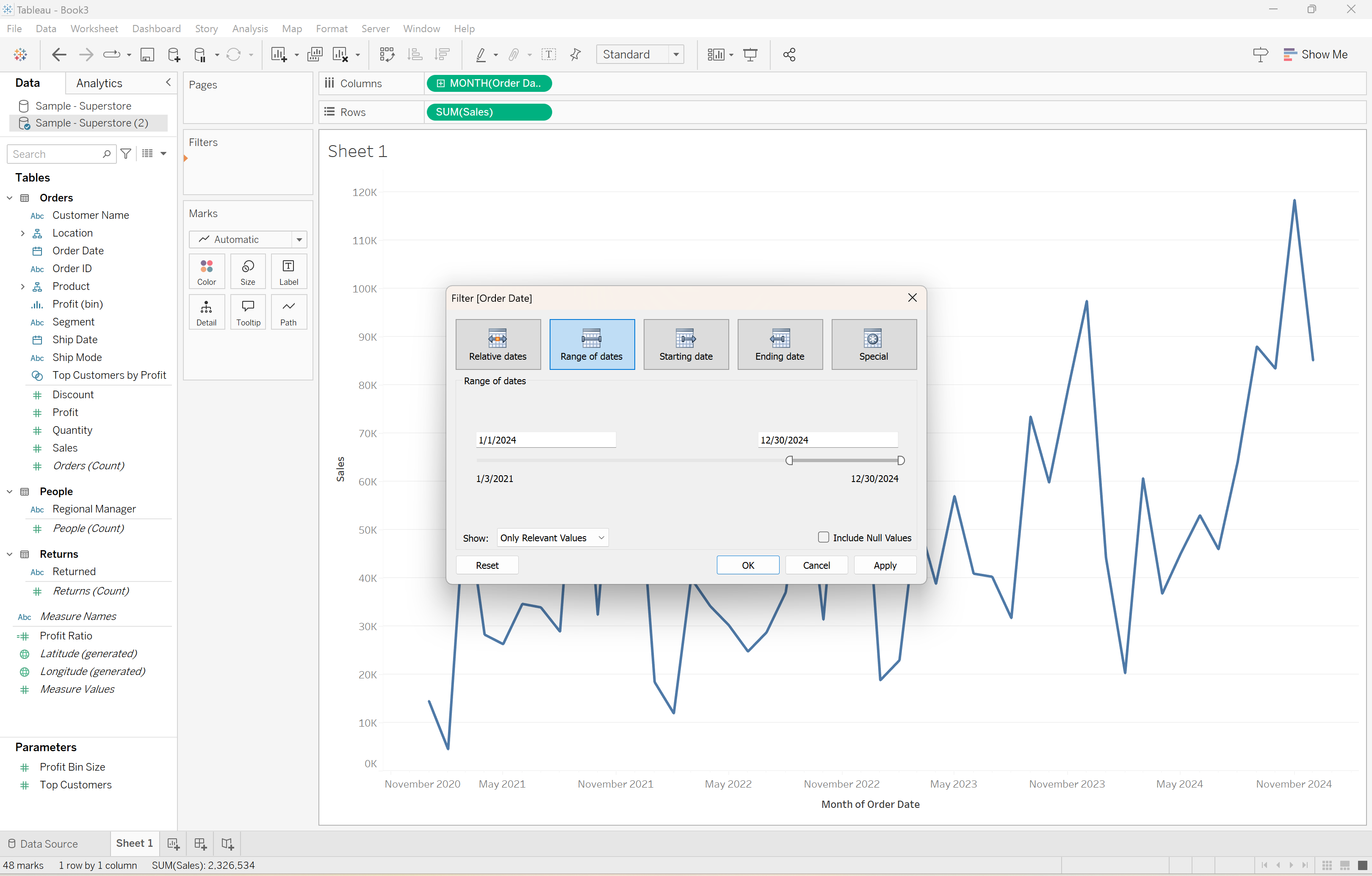
Edit the starting date to be 1/1/2024 and hit OK. Now the line graph is showing the KPI we’re looking for.
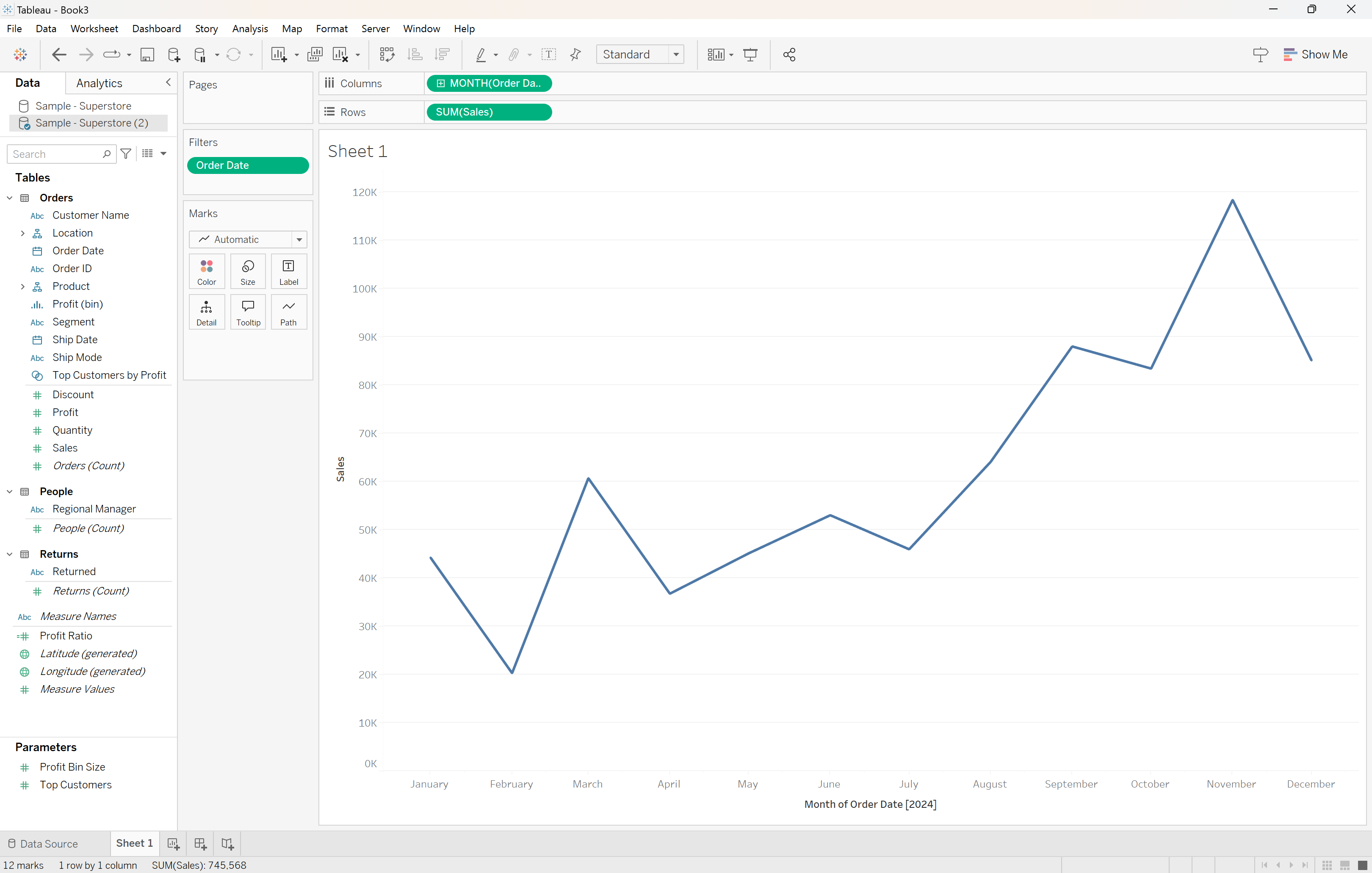
Take some time to further refine the graph, adding labels, removing unneccessary text, and changing the color. Tableau’s interface is fairly intuitive for this sort of thing.
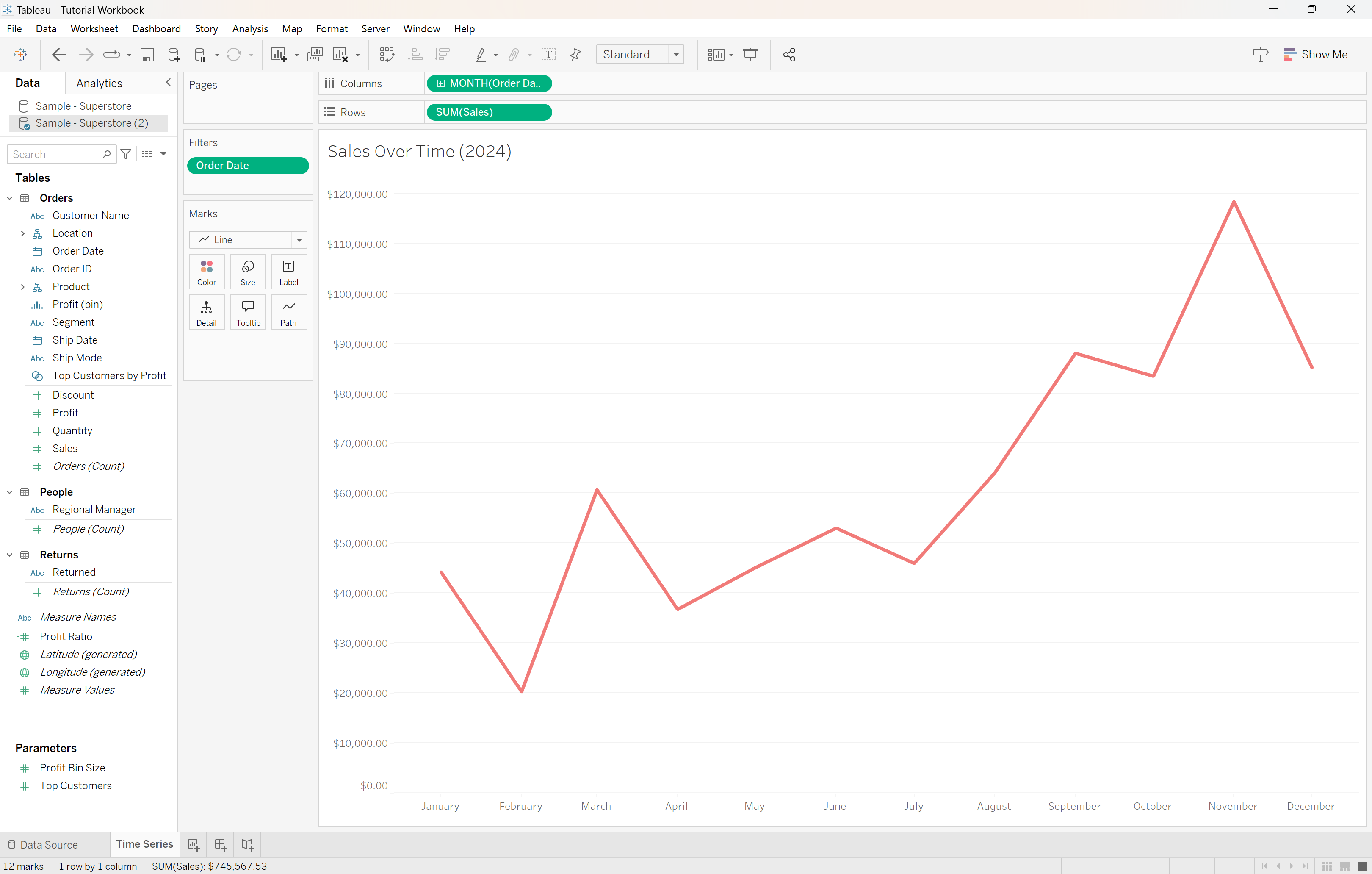
Our graph of sales over time is ready! A KPI visualization like this helps decision-makers see things such as seasonal trends in sales or the effect of a new promotion on sales as compared to sales before the promotion was implemented.
Bar Chart
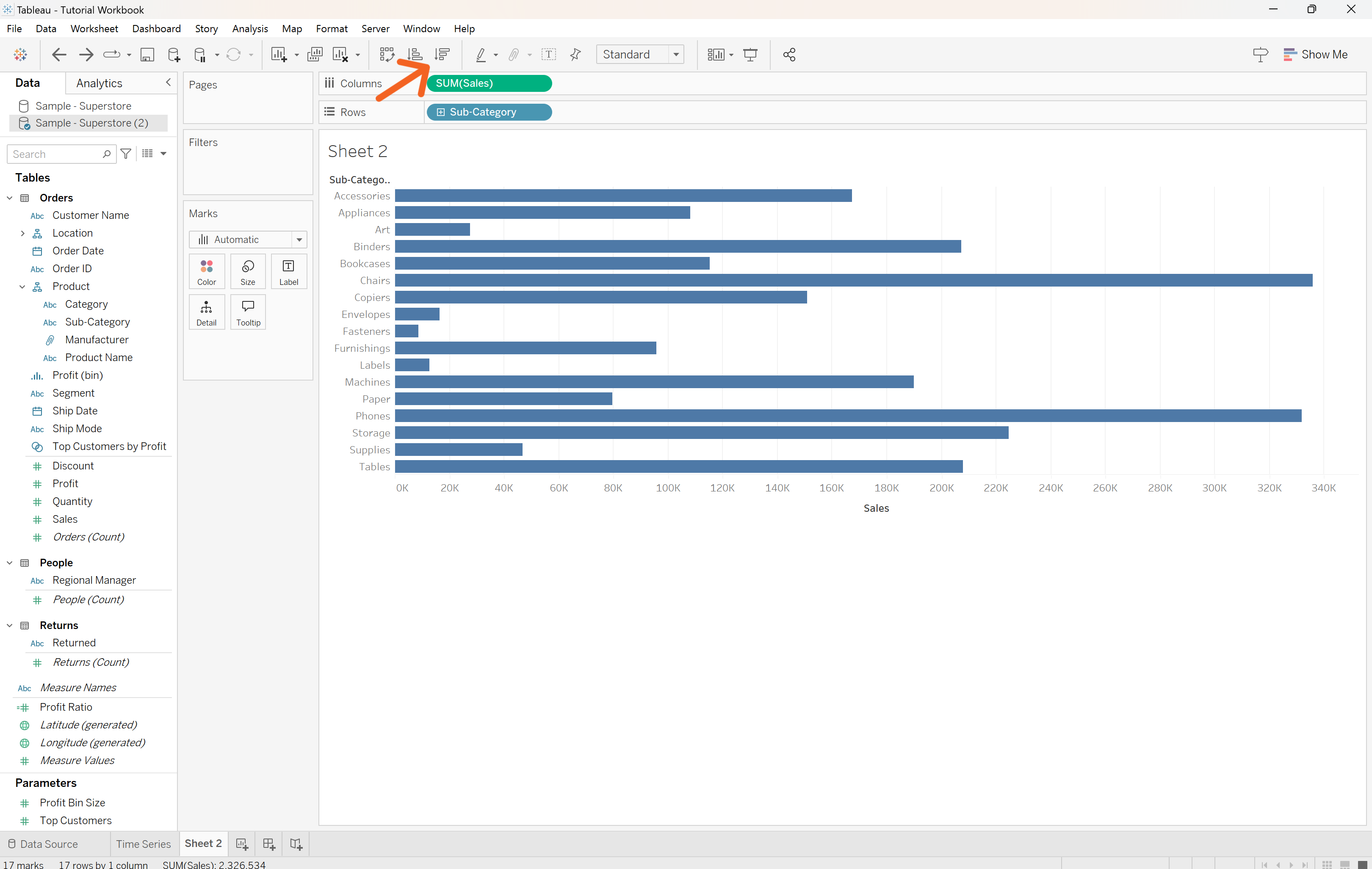
Another great KPI for Superstore sales data could be Top-Selling Categories. Let’s make a bar chart to display these. Click the chart icon with the plus sign at the bottom of the screen to add another worksheet.
Go to the variables on the left side of the screen and click the dropdown next to Product. Drag Sub-Category to the Rows. Drag Sales to the Columns. You should get a bar chart like this, and you can make the chart more readable by clicking the sort button at the top to put the bars in descending order.
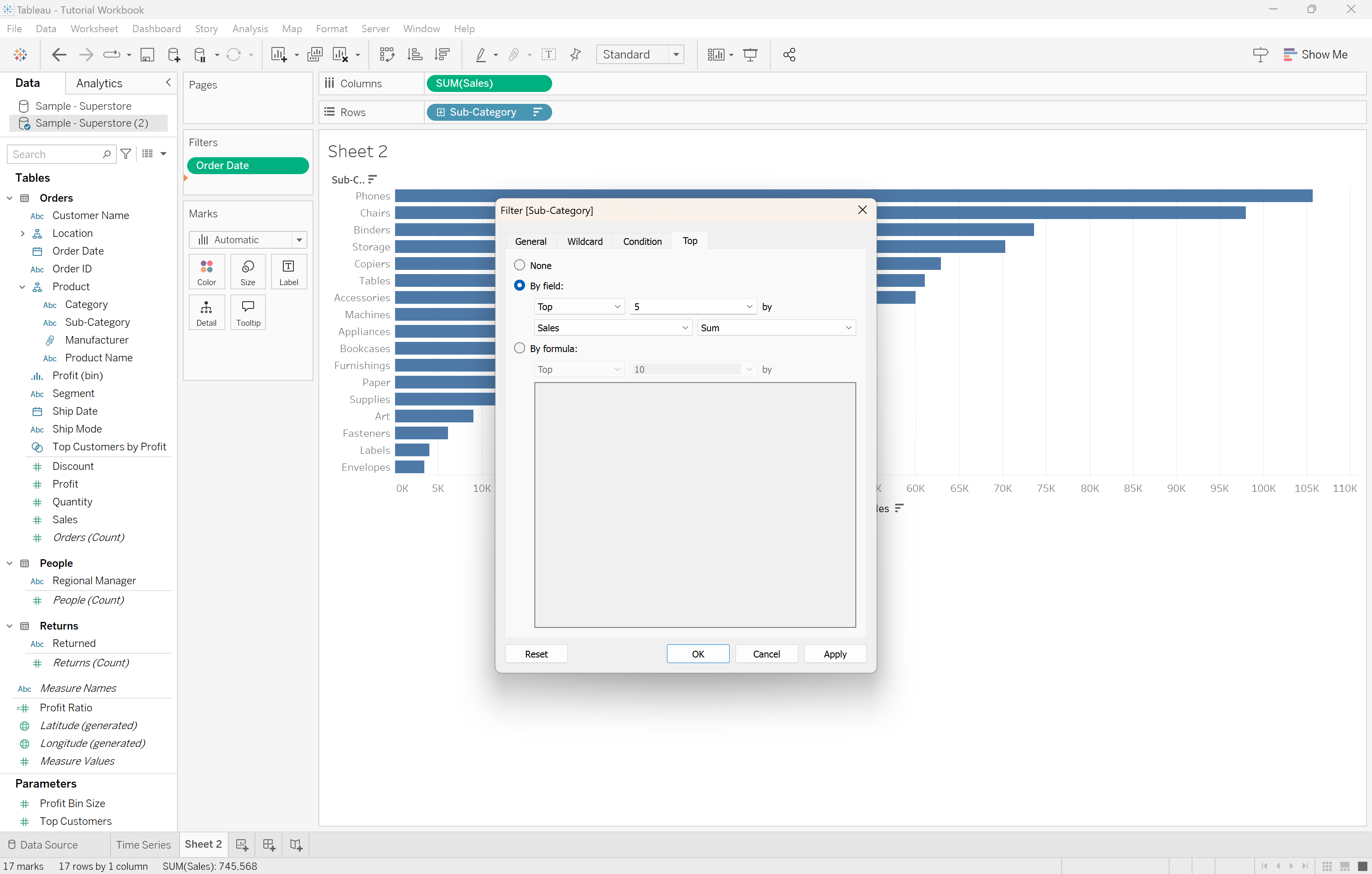
Again, the stakeholders are mostly focused on sales during 2024, so create the same time filter by dragging Order Date to the Filters box and focusing in on dates in 2024.
The visualization would probably be more effective if we just limit it to the top 5 categories of merchandise. To do this, drag Sub-Category from the left onto the Filters box and select the Top tab at the top. Tell Tableau you want it to display the top 5 sub-categories by sum (or total) sales.
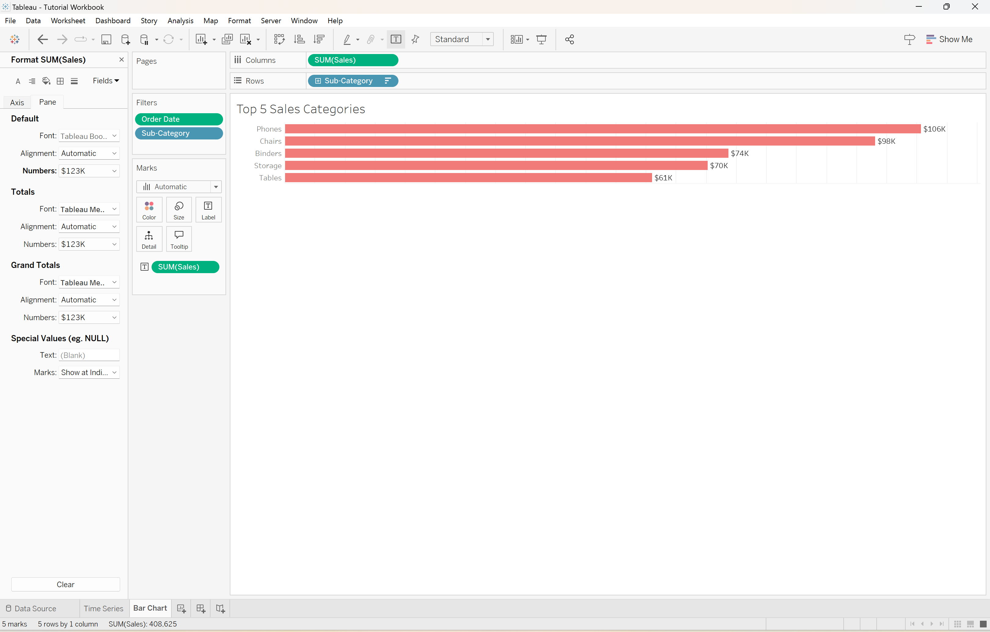
Now we can again make some minor adjustments based on aesthetic choices. We’ll end up with a bar chart that looks like this:
Map Visualization
So far, these KPIs are specific, relevant, and achieveable, so we’re on the right track. The last visualization we’ll add for this simple example is a way to determine sales by location within the United States and Canada.
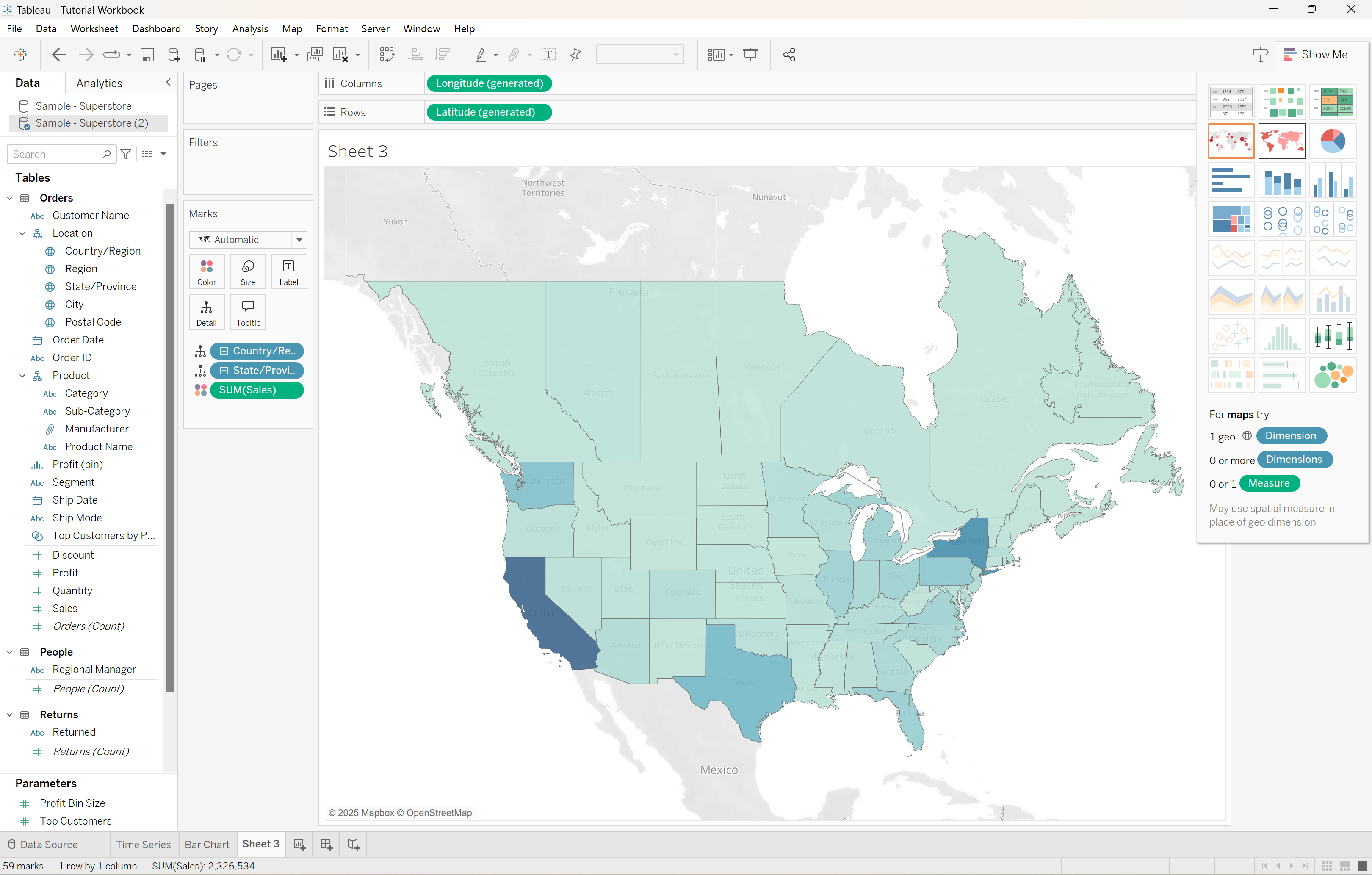
Create a new sheet, and double-click Sales. Go to the drop down under Region and double click State/Province. You’ll be presented with this bar chart which is not very enlightening, but this is where one of my favorite features of Tableau comes in! Click the Show Me button in the top-right corner.
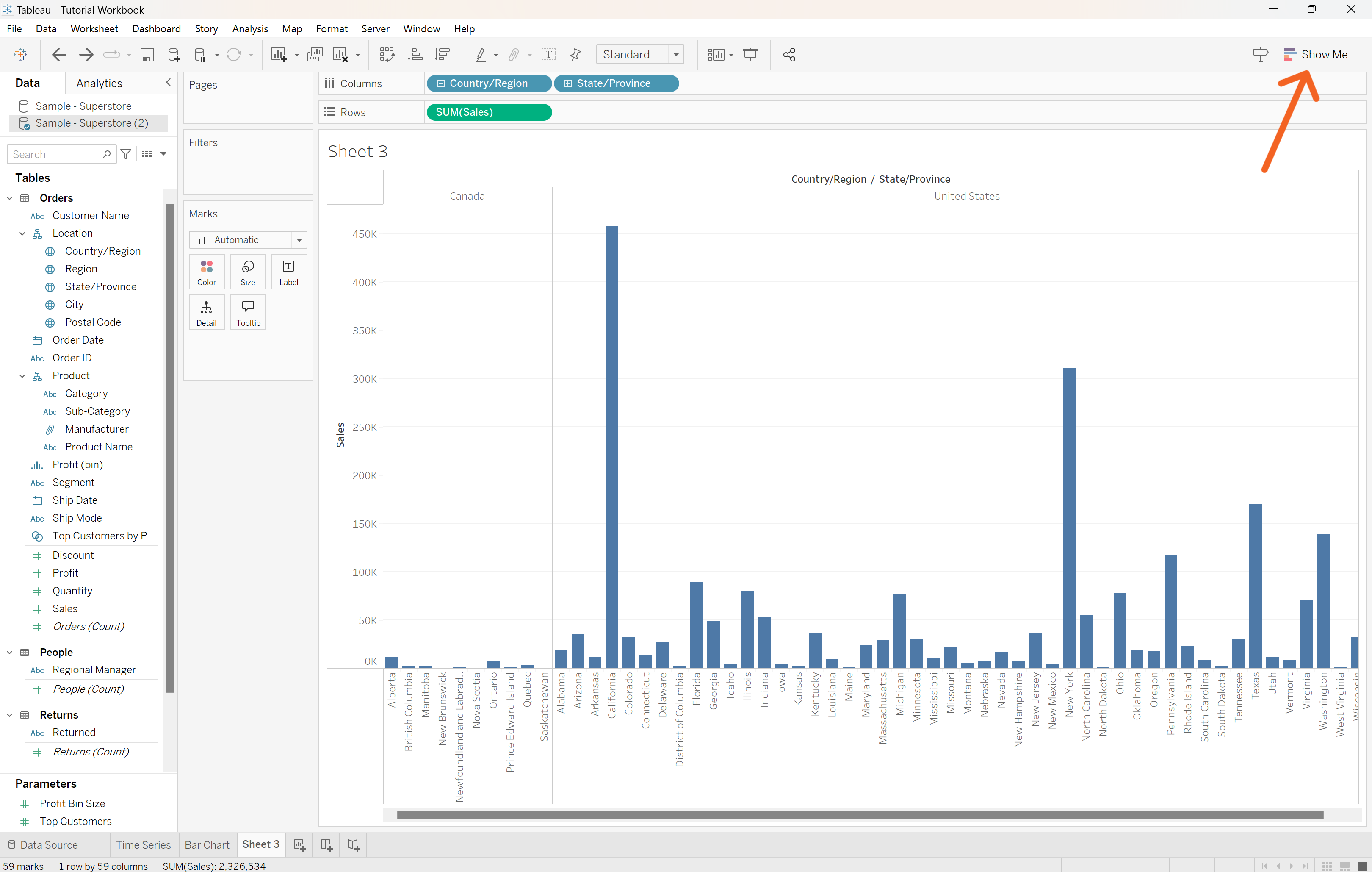
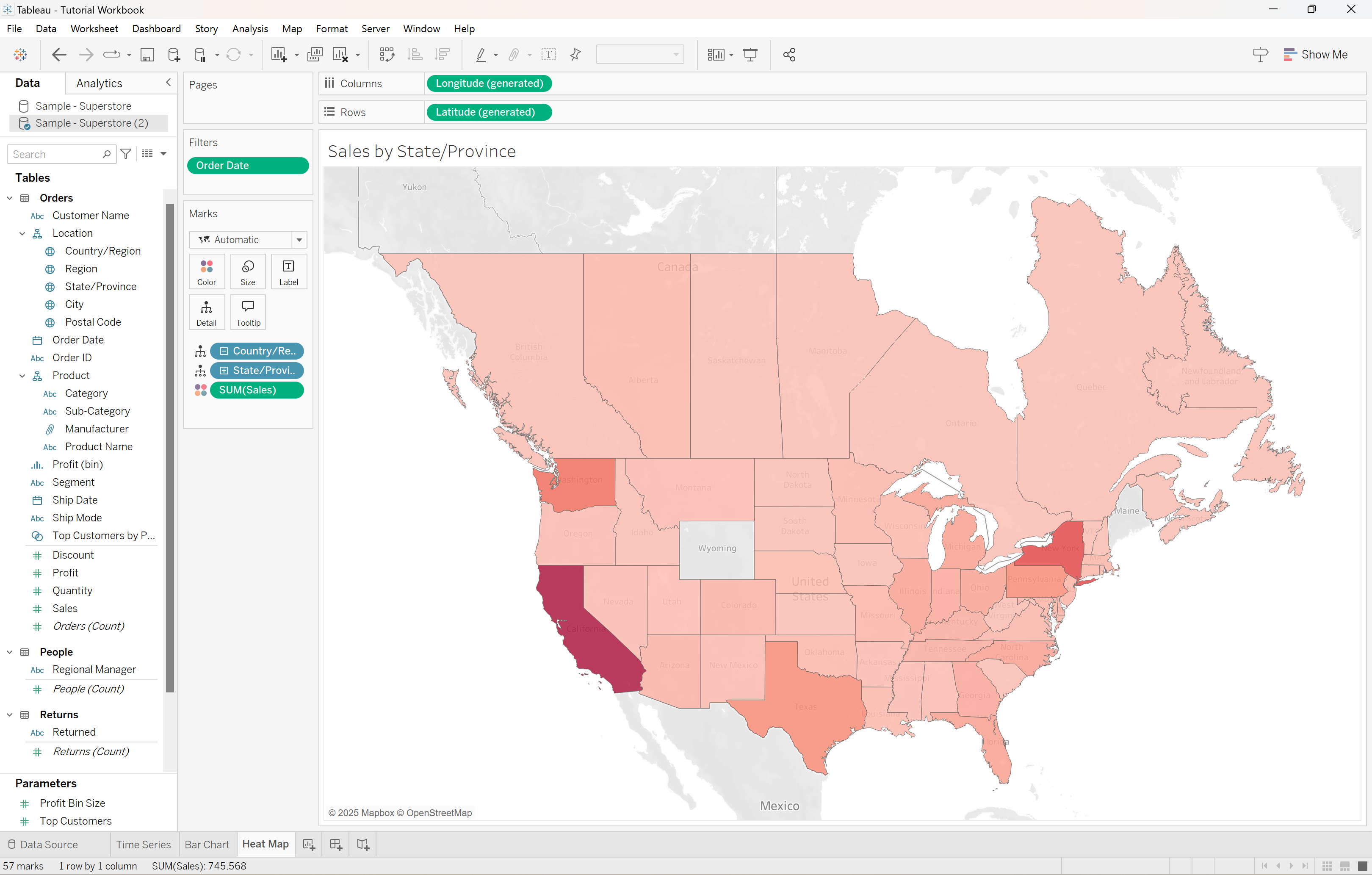
This opens up a menu of potential visualizations for the variables we’ve selected. Click the second map, which shows different shades of red. Tableau generates this map with darker shading in regions with higher sales:
This is exactly what we’re looking for! Change the color to match the other visualizations, and rename the graph to something descriptive. Don’t forget to display only data from 2024.
Step 3: Creating the Dashboard
Now comes the best part! We can put all of these KPI visualizations together into one functional and beautiful dashboard.
To begin, click the New Dashboard button at the bottom of the screen.
Clicking that will bring us to a blank dashboard. We can create the dashboard by dragging sheets to the center, the same way we dragged variables over to create sheets. Start by double-clicking the line graph.
Now we can add our other visualizations as well. We want them to be below the graph of sales over time, so drag a Horizontal Container from the Objects section to under the line graph. Drag the map and bar chart to their places as well.
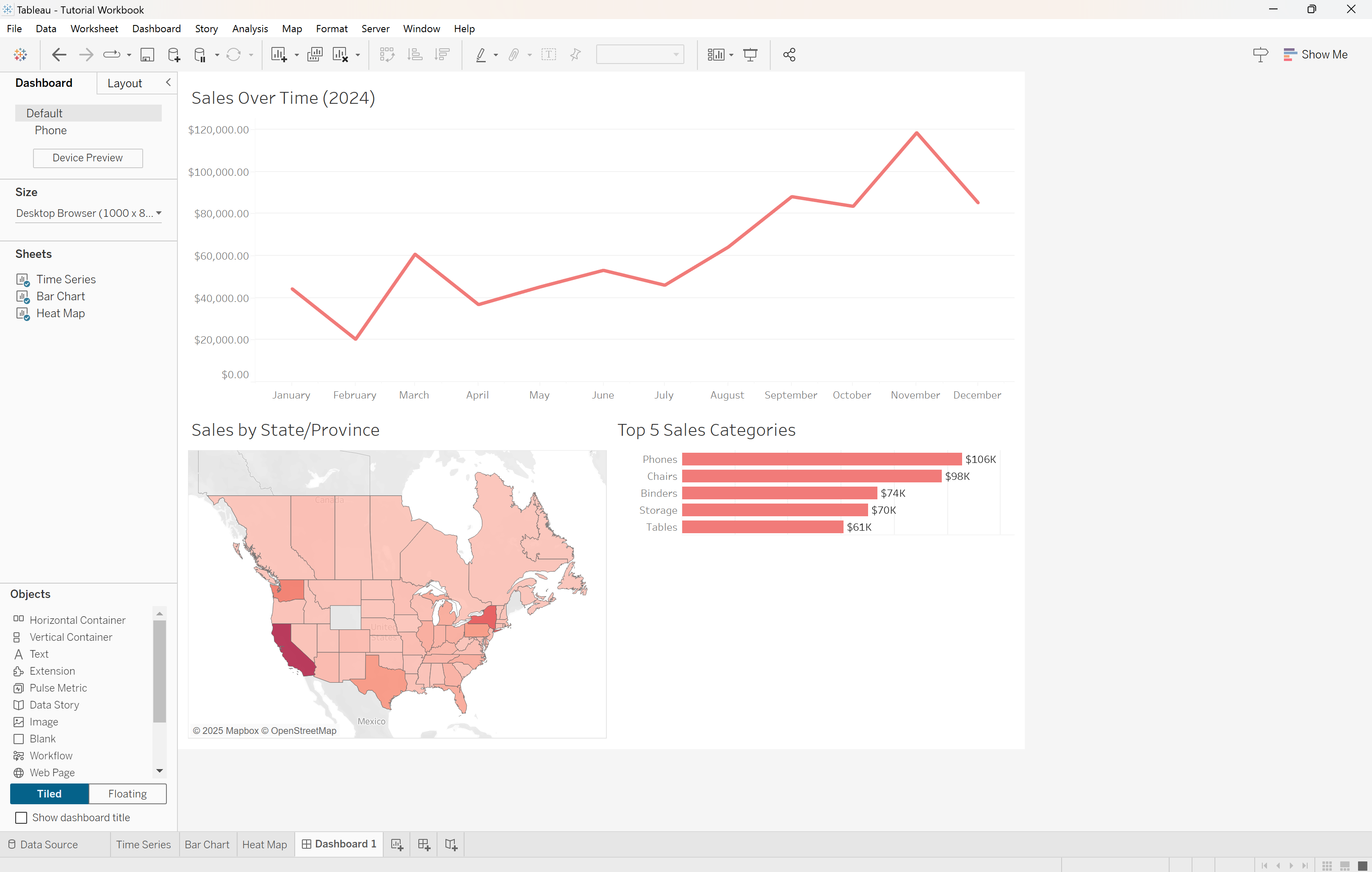
We now have an incredible way to view all our sales KPIs in one place. We’ll add one final detail to make this dashboard even more useful to the stakeholders.
To allow viewers to filter by state/province, click on the map visualization, and click the Use as Filter button.
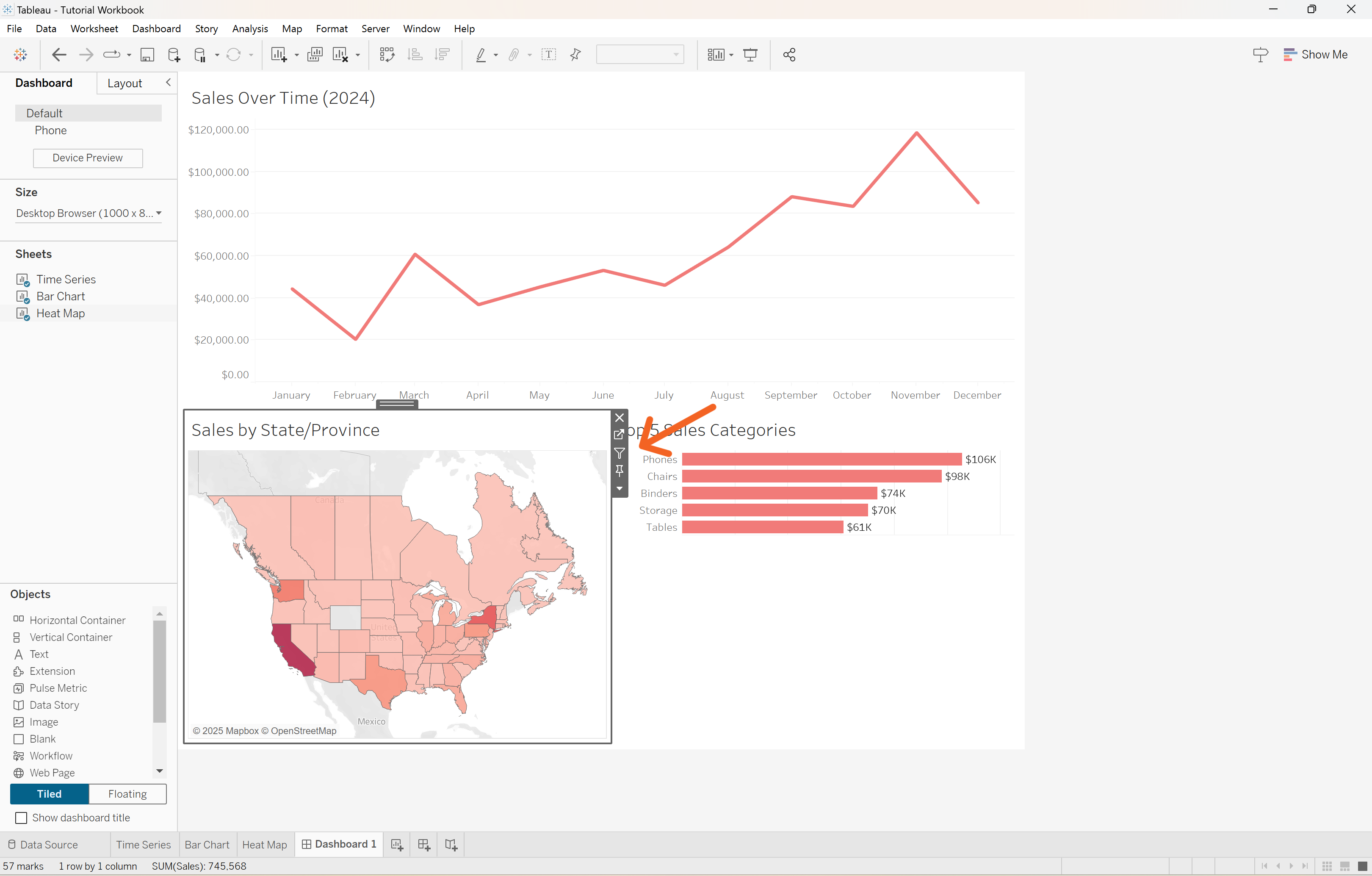
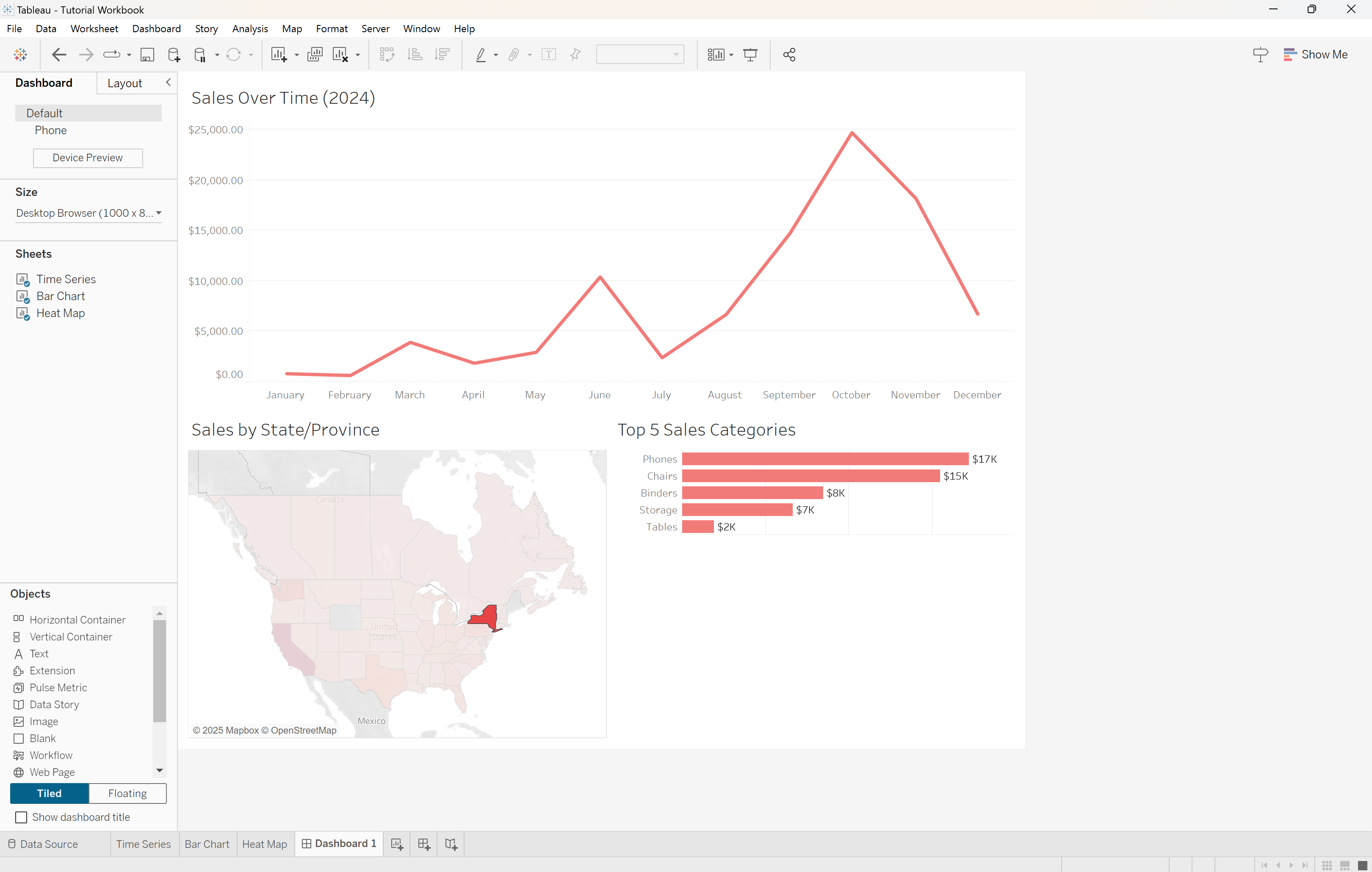
Now, if a viewer wants to filter the entire dashboard by a state or province, they can simply click it on the map, and all three visualizations will adjust accordingly. For example, when New York is selected, the dashboard looks like this:
Conclusion
Creating a KPI dashboard in Tableau is a simple yet effective way to communicate key information to those who need it. While the KPIs will differ depending on the organization and its goals, Tableau is a flexible software, and I’ve barely sratched the surface of what it can do. I love Tableau because it helps me use data to tell stories that need to be told in an eye-catching and professional way.
Now it’s your turn! I invite you to expiriment with the Superstore dataset and see if you can recreate my dashboard, along with any other interesting KPIs you can visualize. Additionally, check out Tableau Public, an online platform to share Tableau visualizsations with others. It’s a great place to go for inspiration.
If you enjoyed this tutorial or have any feedback, feel free to let me know through LinkedIn!