I created a Streamlit app to showcase some of the most interesting findings from the Super Bowl Ad dataset I curated. What insights did I uncover?
Getting Caught Up To Speed
If you’ve been following my blog, you know I’ve put lots of time and effort into curating a comprehensive marketing dataset for the 2024 Super Bowl ad lineup. You can check out my data gathering process and get up to speed here.
The Super Bowl is perhaps the most important marketing event of the year, and brands line up to pay exorbitant prices for spots that are usually only 30 seconds long. So is their investment worth it? I used my dataset for some exploratory data analysis and also developed a Streamlit app so that you can discover your own insights.
A Word on Streamlit
This was my first time using Streamlit for a personal project, and can I just say, it is awesome! I have never seen such an easy and seamless way to integrate and present interactive visualizations. For anyone who knows Python, it’s very intuitive. I highly reccommend giving it a try. The documentation can be found here, and you can check out my code for this entire project in this GitHub repo. Now let’s get into the analysis!
Interesting Findings
Some of the most interesting findings from my exploratory data analysis were already mentioned in my last post. I mentioned the ads with the most YouTube views, the best view-to-like ratio, what proportion of ads included celebrities, and what proportion of ads experienced a 5-year peak in Google search popularity on the week of their Big Game ad.
One thing I didn’t dive into as much was the marketing polling data I gathered. This visualization, featured in my Streamlit app, is a lollipop chart showing the brands that gained the most momentum,which measures consumers’ perception of whether a brand is gaining or losing market position against its competitors.
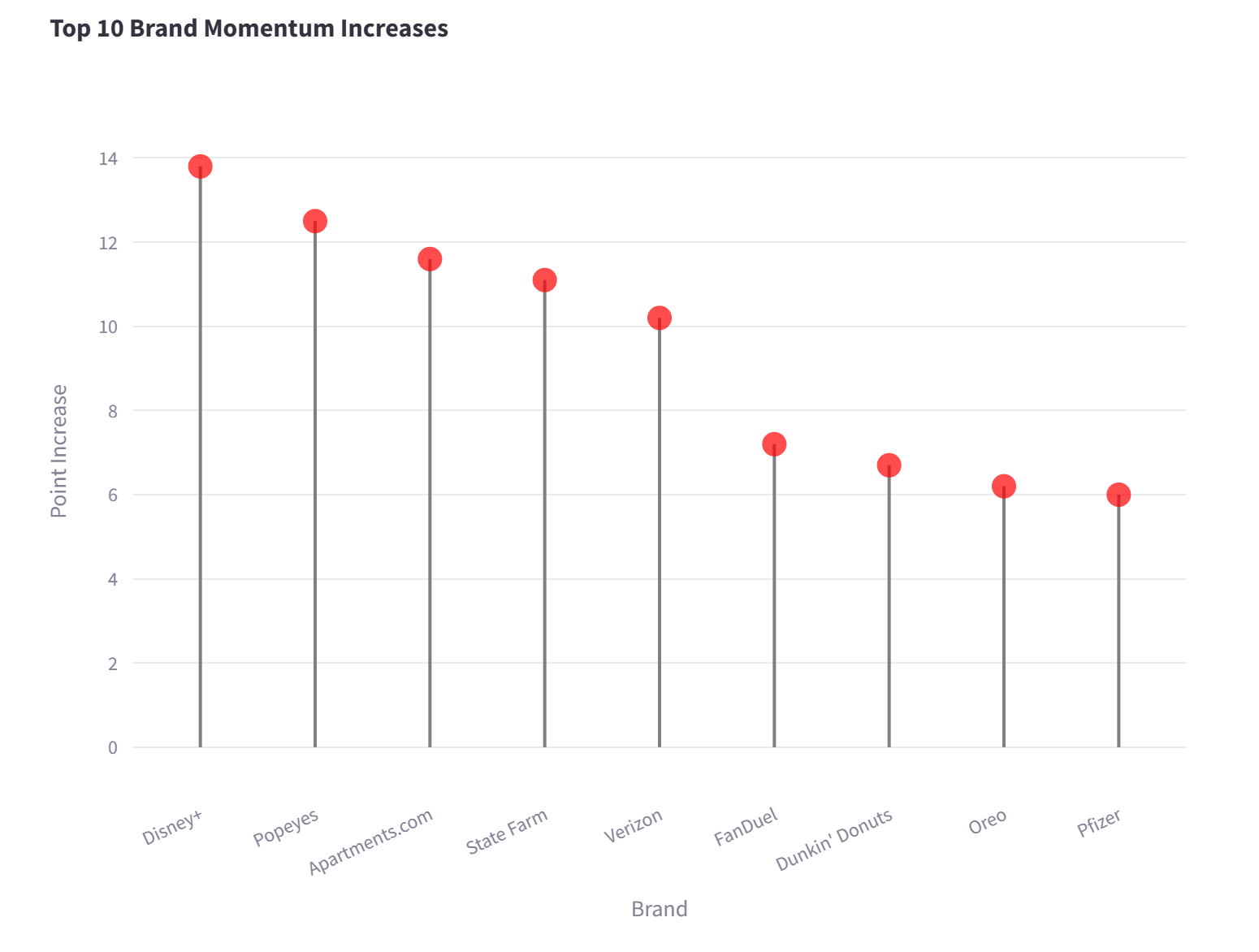
Interestingly, Disney’s streaming service Disney+ made the top of this list. Disney’s momentum has been up and down a lot recently with some of their more controversial production choices.
My Streamlit App
All of the different angles of analysis that I’ve mentioned and more can be explored using my Streamlit app, linked here!
The app is separated into tabs for YouTube Stats, Google Trends, Polling Data, and Celebrity Influence. There are lots of different ways to filter and adjust the data. Feel free to:
- Control how many video engagement stats to view and in what order
- Use the dropdown to select a brand and explore its Google popularity after releasing its ad
- Explore a marketing metric of interest
- Segment the celebrity influence data based on different measures of success
I’m excited to hear about the observations you make.
What Now?
Going forward, I hope to eventually use this data, and gather more like it, to create a predictive model that helps determine whether an ad will have a good return on investment. If you have any ideas, or want to learn more about how I made it this far, please reach out on LinkedIn!