I was inspired by the 30 Day Chart Challenge account on LinkedIn. Can I make a data visualization each day in April that I'm proud to show off?
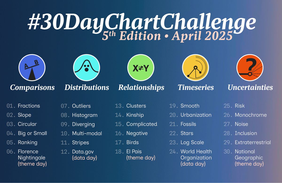
The Challenge
Each April, data viz professionals from around the world participate in the 30 Day Chart Challenge. This challenge has been going on for several years, and according to their page, it was created by Cédric Scherer and Dominic Royé, supported by Wendy Shijia and Ansgar Wolsing. This year, the prompts are as follows:
Because I’ve recently learned Tableau, as well as becoming more confident in my data visualization skills in Python, I was inspired to participate in the challenge! Even though half of this month is going to be consumed by my final exams for school, I still wanted to have a personal project that would remind me why I’m studying statistics and that data can be fun! We will see how this goes. I think it will also be a good test of my diligence.
I will display each chart and my explanations here, and I’ll list the data sources and the software used to create each on at the bottom. Additionally, this Github repo contains all the code and data.
Category 1: Comparisons
Day 1 - Fractions
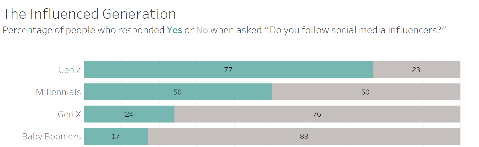
For the first prompt, I chose to visualize data about the increasing importance of influencer marketing for Gen Z. When I thought of the prompt “fractions,” a stacked bar chart immediately came to mind. These charts are great for comparing proportions among different populations.
Day 2 - Slope
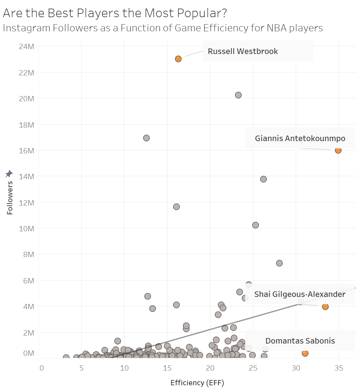
For day two, I’ll be honest, I forgot a little bit about the overarching category of comparisons. I focused a lot on “slope.” I’m still getting the hang of how this challenge works! For today’s chart I chose to visualize the relationship between the basketball ability of an NBA player and the size of their Instagram following, with a focus on the players that had an unusually low or unusually high number of followers for their skill level.
Day 3 - Circular
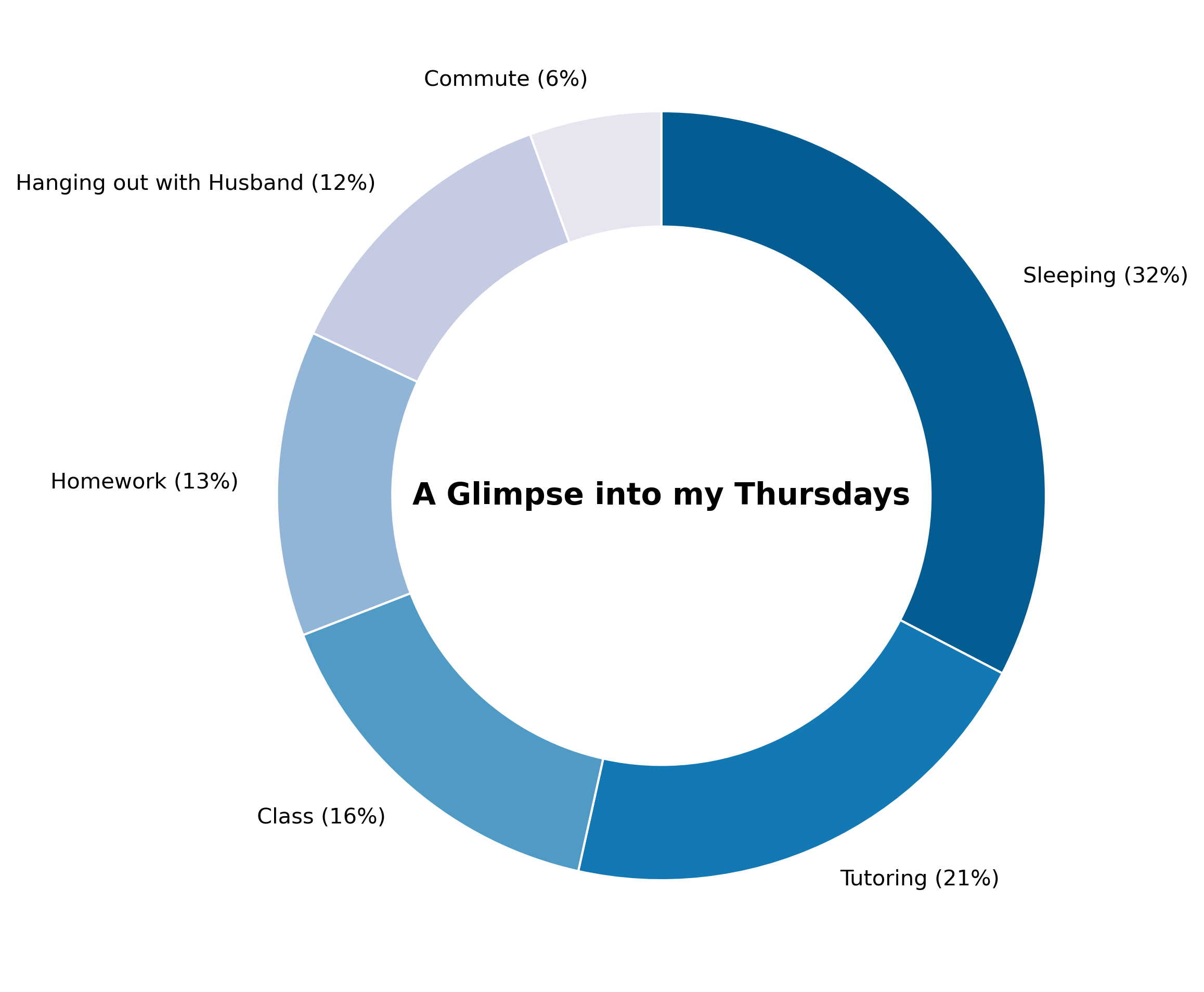
For today’s chart challenge, I chose to use a donut chart to compare the way I allocate my time to each category on Thursdays. Donut charts are a more palletable version of a classic pie chart, in my opinion, but still not the most visually interpretable.
Day 4 - Big or Small
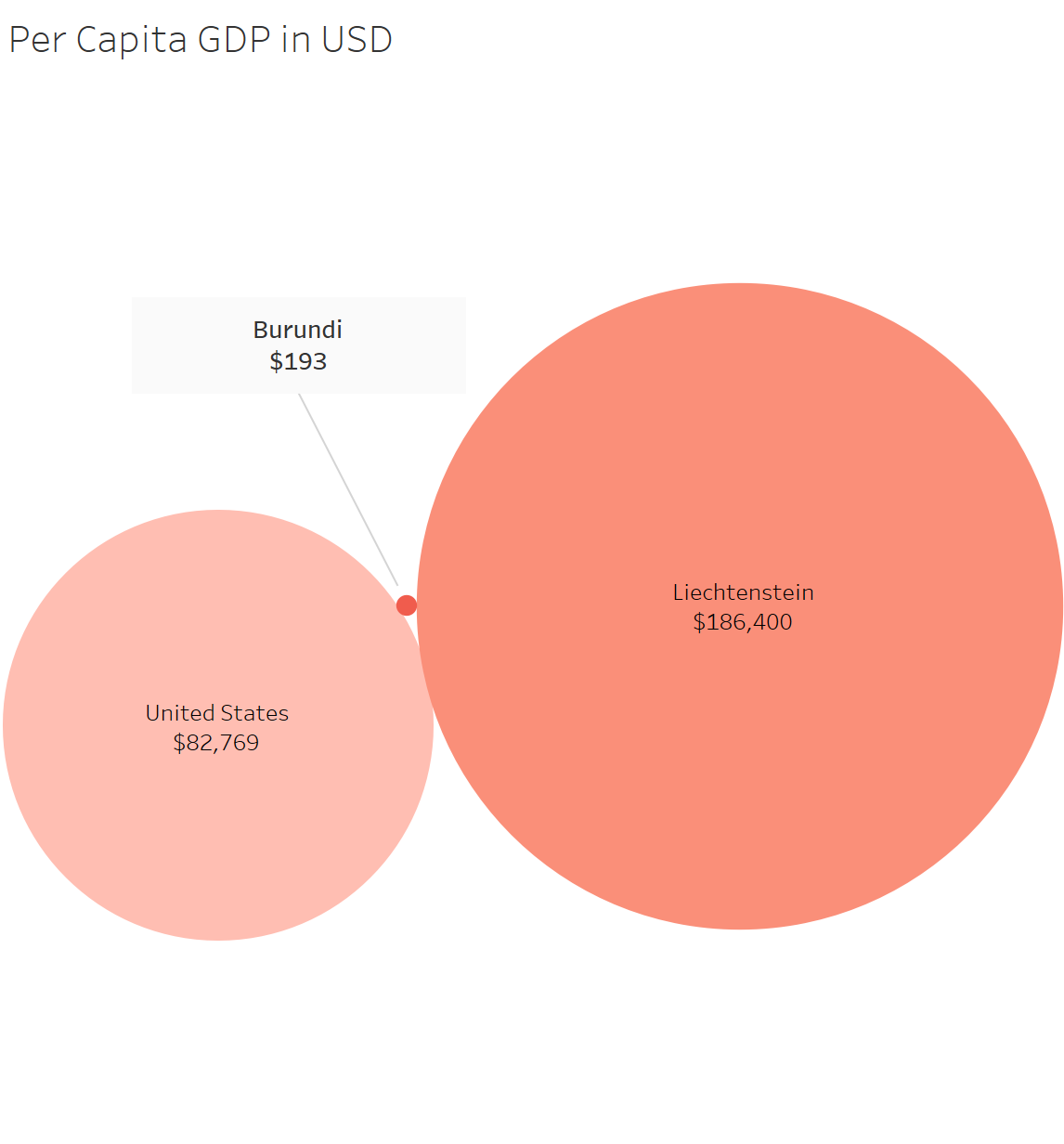
For today’s prompt, I wanted to visualize the difference in per capita GDP between the richest and poorest country. I also added the United States as a point of reference. I played around with the colors and labels a bit on this one, and I’m happy with how it turned out. I think it communicates the message clearly.
Day 5 - Ranking
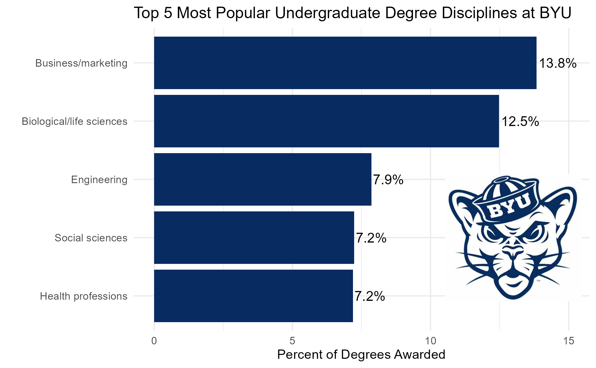
My visualization for today ranks the top 5 most popular fields people graduate in at my school, Brigham Young University. This bar chart ended up being surprisingly tricky to do in R because of the extra details I wanted to add, and it was my first time using the ggimage package to include an image, so I learned a lot.
Day 6 - Florence Nightingale
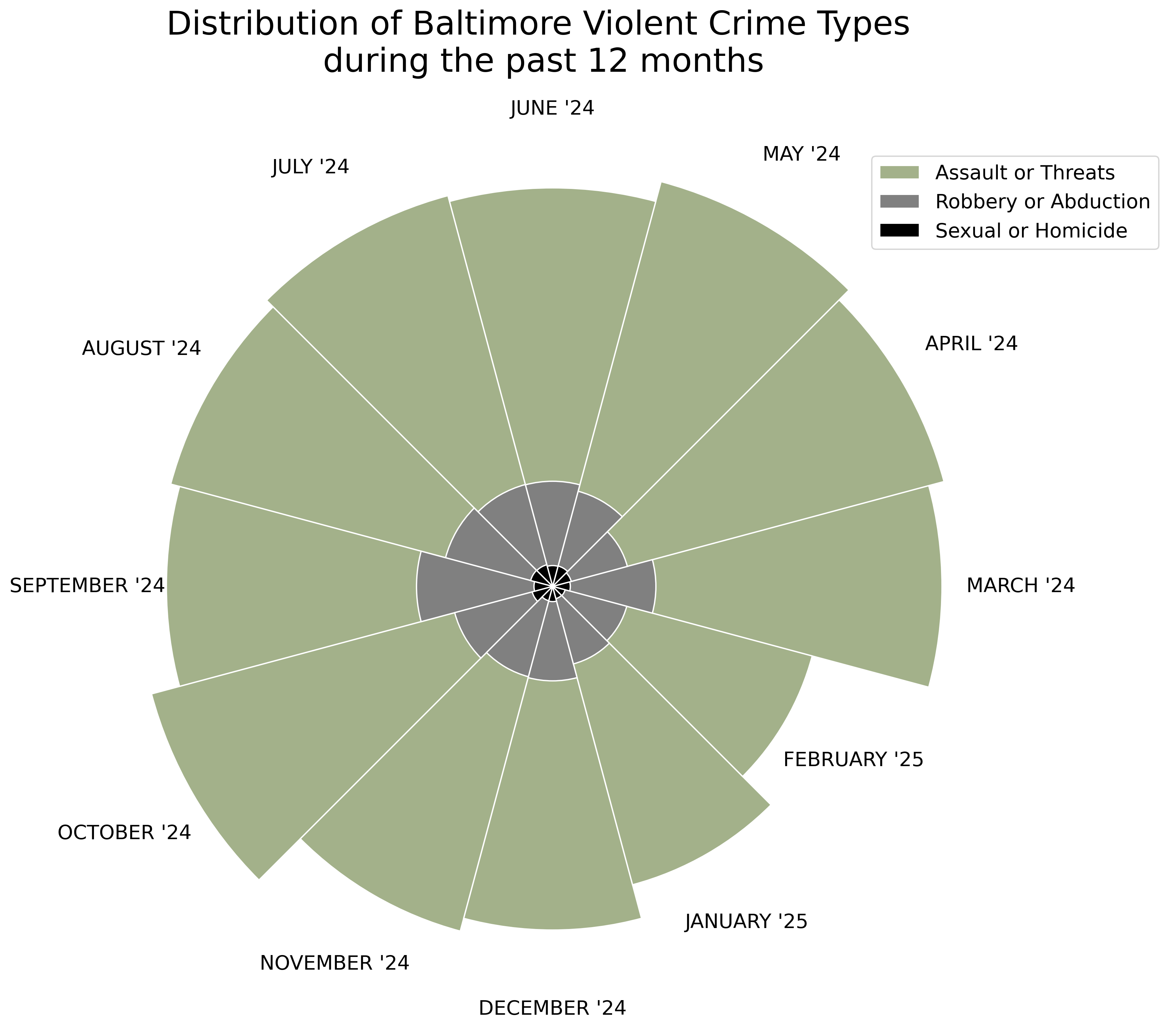
Today’s visualization, inspired by Florence Nightingale’s famous Crimean War chart, represents the distribution of violent crime types over the past year in Baltimore. These rose charts are very aesthetically pleasing and I think they communicate well. However, they’re limited by the lack of numerical labeling. In the future, I’d make a tooltip to help with that.
Category 2: Distributions
Day 7 - Outliers
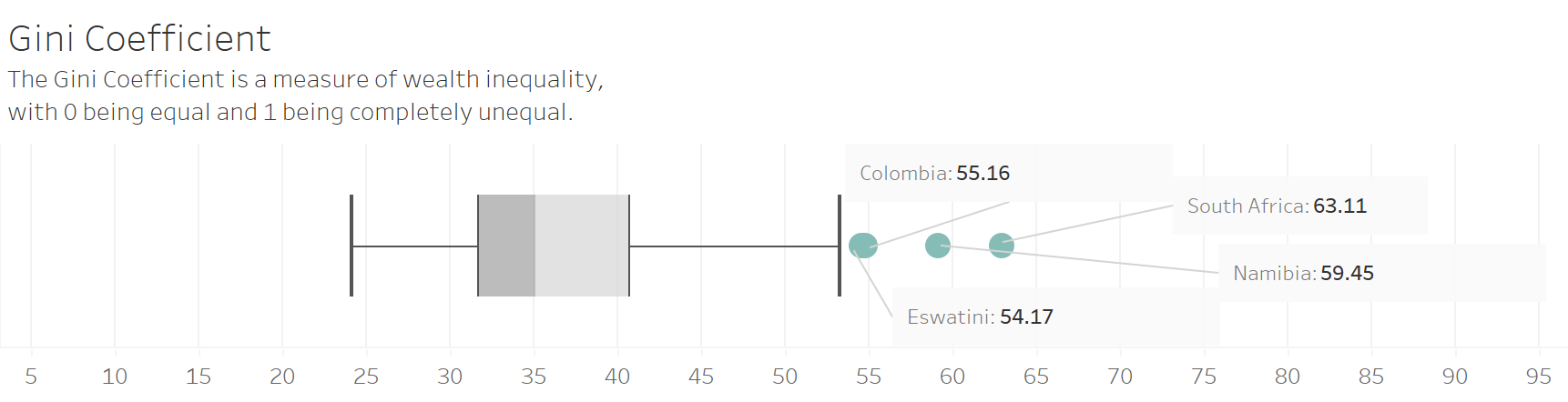
This visualization shows the distribution of the Gini coefficient among the countries of the world, with four obvious outliers. While they can be a little tricky for people less fluent in data to conceptualize, I still think boxplots are a great way to clearly show outliers.
Day 8 - Histogram
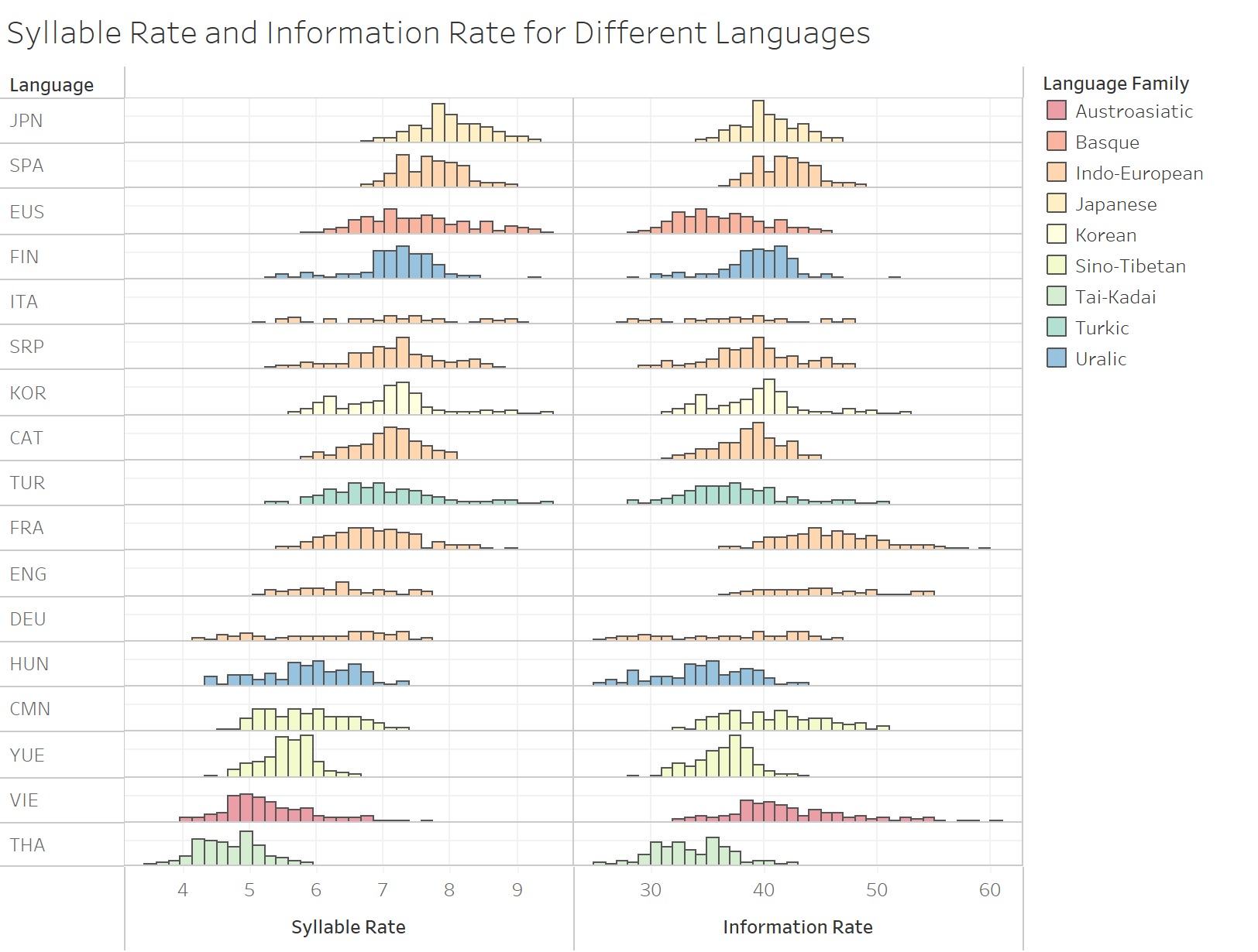
Today I wanted to share one of my very favorite visualizations that we made in my recent Data Visualization course. I made these histograms (with guidance from my incredible professor, Dr. Natalie Blades) as a way to compare the language efficiency among different languages and language families.
Day 9 - Diverging
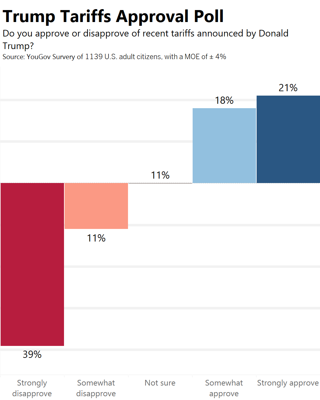
I think diverging bar charts are a really effective way to display Likert scale polling data. When I read today’s prompt, I immediately thought of the polarizing tariffs recently put into place by President Trump. While I’m most interested in becoming a business analyst, I find politcal data fascinating and important.
Day 10 - Multi-modal
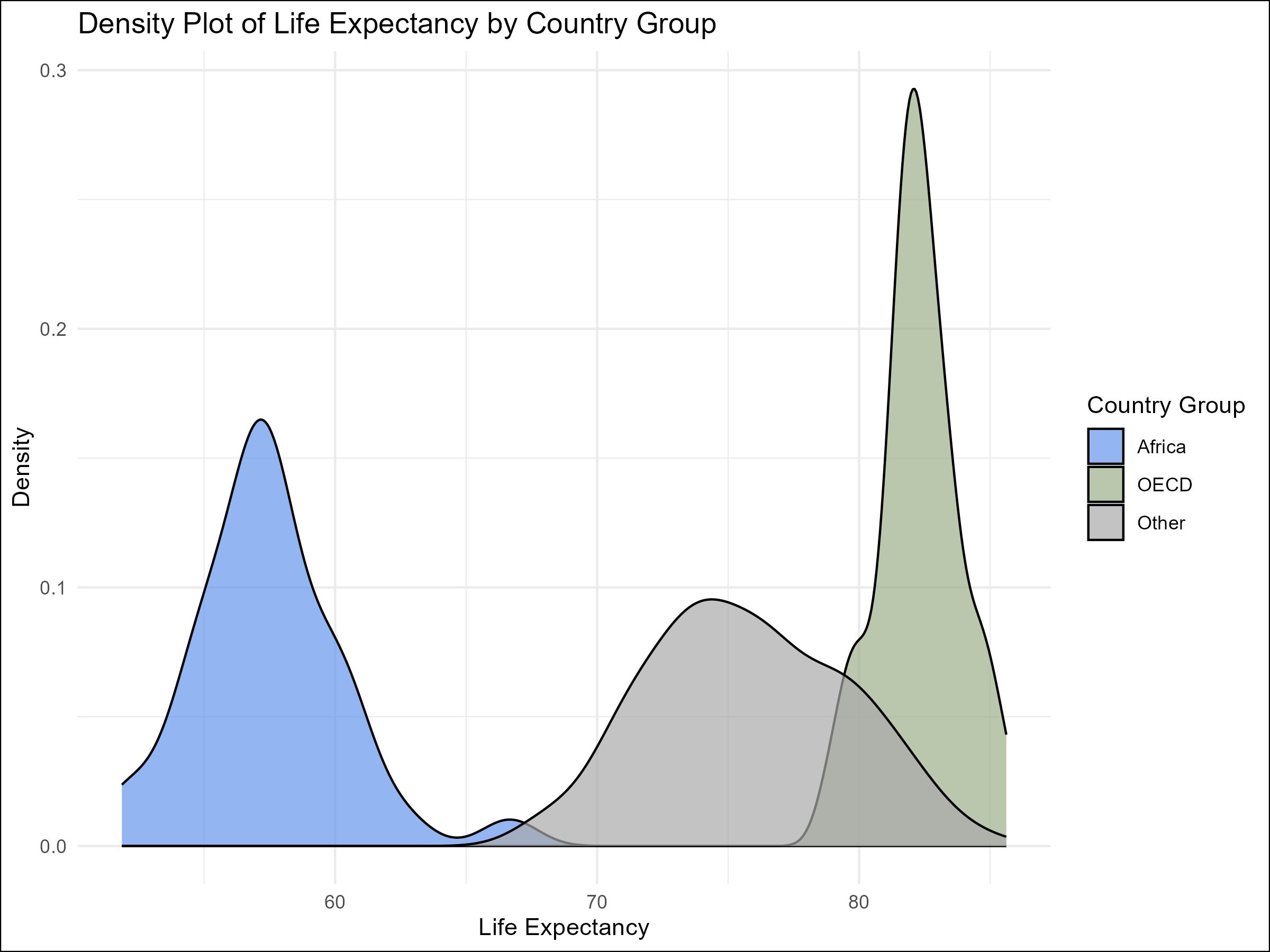
When I thought of data with multiple modes or centers, I thought of this life expectancy data. There is a clear difference between the distributions for different country groups (the OECD is an organization of high-income, well-developed countries).
Day 11 - Stripes
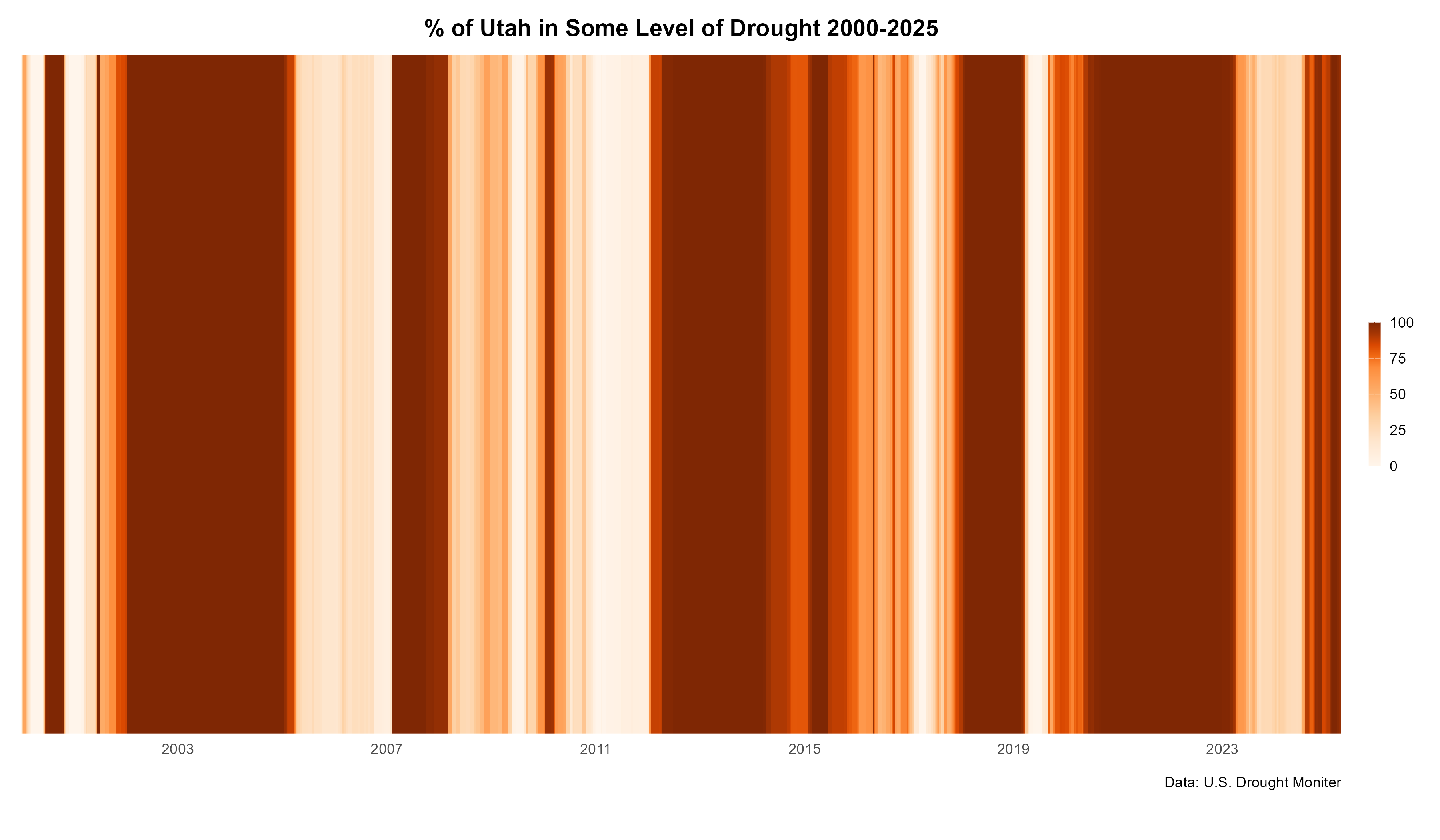
This style of visualization, famously used to show climate chage data, felt like a good fit for this Utah drought data from the U.S. Drought Monitor. The darkness of the stripe indicates what percent of the state of Utah was experiencing some level of drought that week.
Day 12 - Data.gov
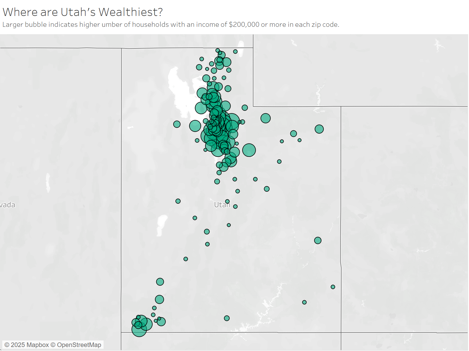
I wanted to use tax data from data.gov to figure out the distribution of high-income households in the state of Utah. I had to do a bit data wrangling buT I think it turned out great! It’s much better to view using the interactive tooltip, which you can check out on my Tableau Public.
I am in the throes of final exams and have decided to take a break from this project. Check back soon for updates!
Footnotes
Day 1: I used Tableau to create the chart, and I got the data from this KS&R article about influencer marketing.
Day 2: The player performance data was from the Official NBA Stats site, and the Instagram data was from this website, which gathers Instagram data for popular basketball players and is updated regularly. The visualization was made using Tableau.
Day 3: I used the seaborn package in Python to create this chart, and the data was calculated from my own life experiences.
Day 4: I used Tableau to create the visualization, and the data came from this indicator on data.worldbank.org.
Day 5: I used ggplot in R to create the visualization, as well as adding the BYU logo using ggimage. The data came from BYU’s official data page,
Day 6: I used Python to wrangle the data and create the visualization, and the Baltimore crime data can be found at this link.
Day 7: I used Tableau for the visualization, and the Gini index data was downloaded at this link.
Day 8: The visualization was made in Tableau, and the data was obtained by my professor from this article. We took inspiration from their use of histograms, as well as this version from The Economist
Day 9: Diverging bar chart made using Tableau, data from YouGov report.
Day 10: Graph made using R, data can be found in my Github Repo.
Day 11: Graph created using R, data from U.S. Drought Moniter. I followed an awesome tutorial from Dr Dominic Royé.
Day 12: Map created in Tableau, data from data.gov.